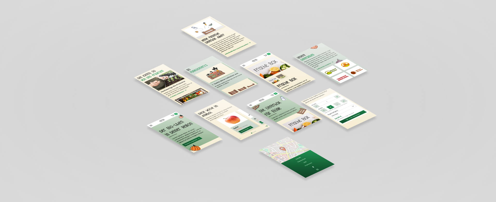


The organic food store "Körnig" sells regional products and offers various services all around a healthy and organic lifestyle, such as delivery boxes with seasonal high-quality food or milk and food vending machines. Plus, they offer service called “animal leasing” which strives to utilize all parts of a butchered animal by enabling customers to reserve desired body parts beforehand. In doing to, less animals are butchered and “animal waste” is decreased.
They want a new website to increase their regional prominence which should bring more customers to the store. This should be achieved as follows:
To make sure that the website fits the needs of the target group, I performed online research and developed three personas who represent Körnig’s most typical customers. Besides a short biography, the personas show information about why they buy organic food, how the target group uses the media and which goals and problems are they dealing with. Personas are an easy way to empathize with different target groups. This makes it easy to prioritize certain features and other issues against each other while keeping the user-centric design approach.
Plus, a competitor analysis was done which included the main three organic food stores in the region. The analysis was focused on the competitor’s websites and their strengths and weaknesses. It became clear that the website quality varies: On the one hand, “Gut Wulksfelde” has a very unique design which mainly uses imagery to support the “organic feeling”, but on the other hand the contrast between the text and the images is not always high enough to keep legibility. The other two competitors have problems with this too, i. e. “Kattendorfer Hof” uses green text on orange buttons which decreases the attractiveness of the calls to action heavily.
Before the design phase, I created a sitemap to make sure that the information architecture is straight forward and easy to understand. As the services provide the website visitors with the highest benefit, the products, delivery boxes and animal leasing are mentioned first in the main navigation. They should motivate the users to get to know “Körnig” a bit more. That’s when the “about” and “contact” pages come into play. The shopping basket is positioned prominently and will make use of the Von Restorff Effect later.
After organized the content on high level, I created wireframes of the start page, a category and a product detail page using a delivery box as an example. Every page was realized for a mobile view and a desktop view. Because of the hypothesis that customers will visit the page on mobile very often (i. e. to quickly get the store’s direction), the wireframes were conceptualized using the mobile first approach.
During the design phase the look and feel of Körnig was develop. At first, I started with an ideation phase where multiple design directions were tested. Afterwards, I created a brand style guide because didn’t have a corporate design yet. The style guide was used as a basis for the screen designs which came next.
When the screen design was done, the static layouts were turned into a click prototype that visualizes the user flow of adding an item to the card. Furthermore, the prototype visualizes interactive states so that it feels as realistic as possible.
Explore Desktop Prototype Explore Mobile Prototype