Since March 2020, the world faced the huge COVID-19 pandemic. The everyday life was massively cut due to legal measures that are targeted to keep everyone healthy. The situation was very unclear as most people didn’t know what to do with regards to the massive growths of COVID-19 across the continent. Consequently, multiple guidelines and rules were set up by the German government which rely on the number of confirmed corona cases in your region. This made it very hard to keep track on the “current rules” due to COVID’s exponential growth.
The goal was to visually show the current state of COVID-19 on a dashboard that uses real-time data. People shall be able to easily find information for their region and understand them quickly. In doing so, it will become easier for them to judge the current situation and behave accordingly. This should be achieved as follows:
When dealing with a huge amount of information, it is key to organize them as clear as possible so that user can understand the shown data easily. The main task is to keep the cognitive load at an appropriate level.
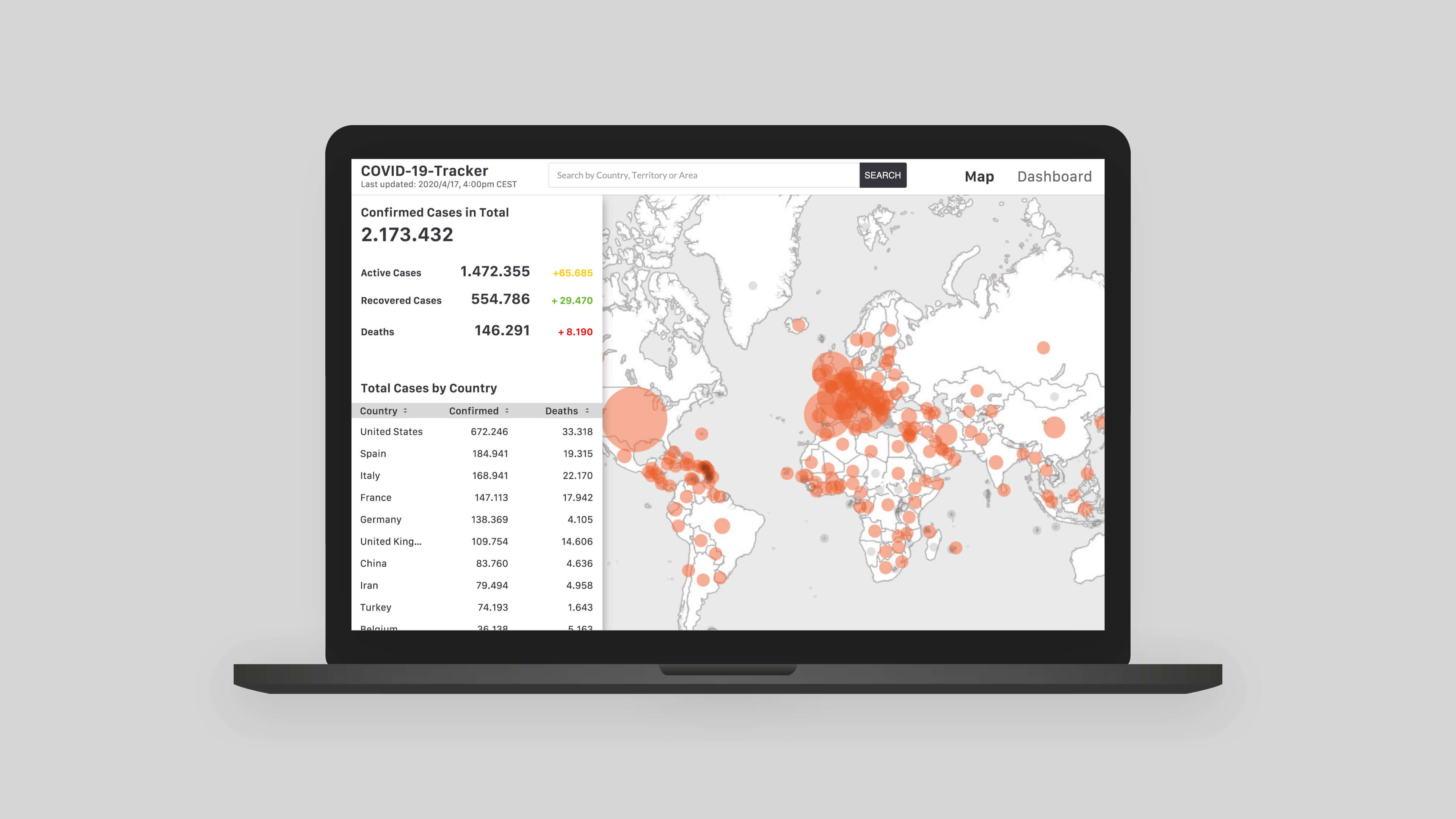
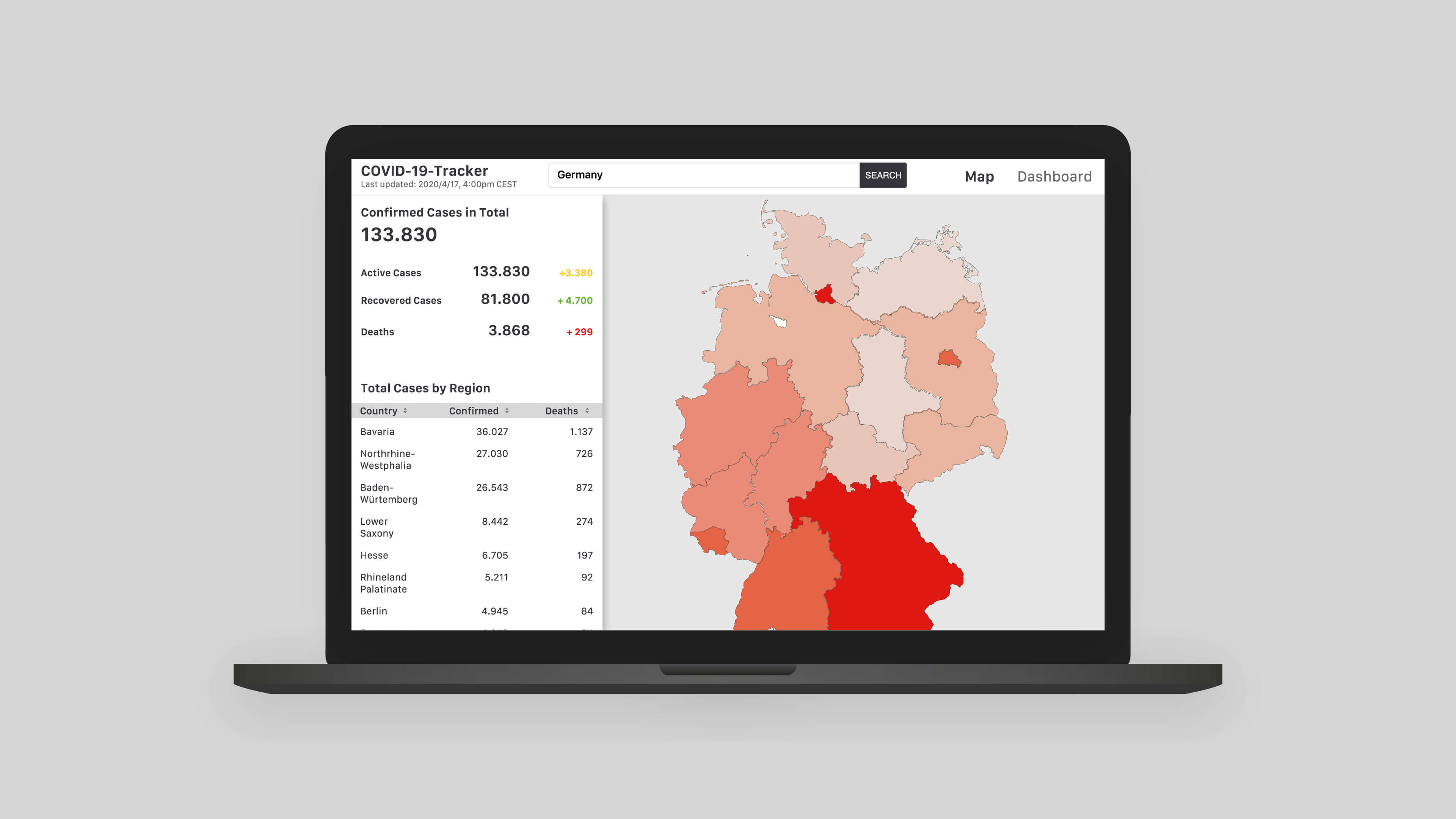
As the government’s rules rely on the number of “active cases, recovered cases and deaths”, this information should always be visible on any device. For an easy understanding, users should be able to select the information level so they can choose the abstraction level of the visualized data. The shown data should be visualized as a colored coded map, so hot spots and comparisons can be quickly seen by the viewers. The design focus shall remain on the data so the layout must not use too many colors and prominent design elements. They tend to distract the viewers which makes it more difficult to quickly receive the needed information.
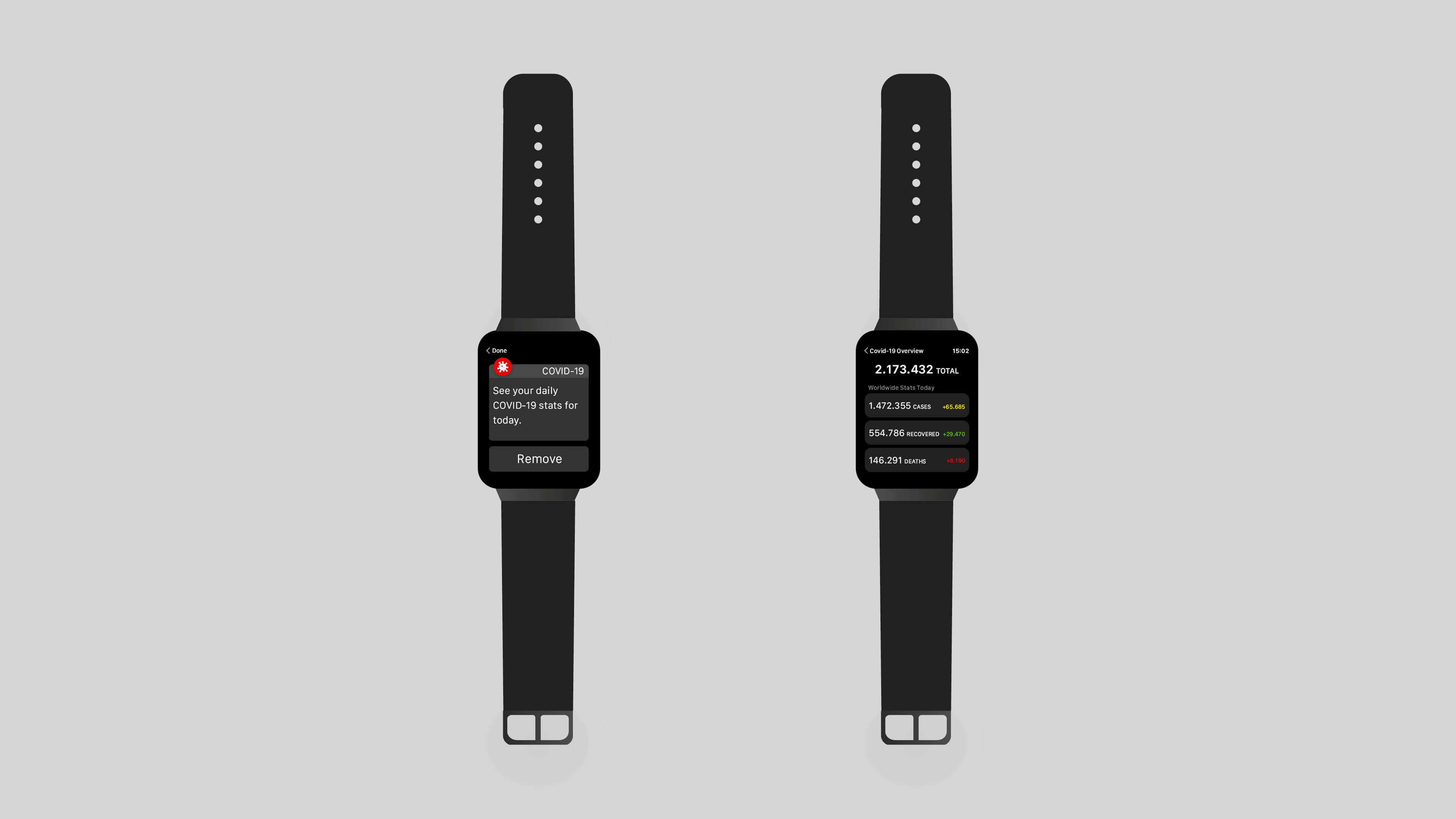
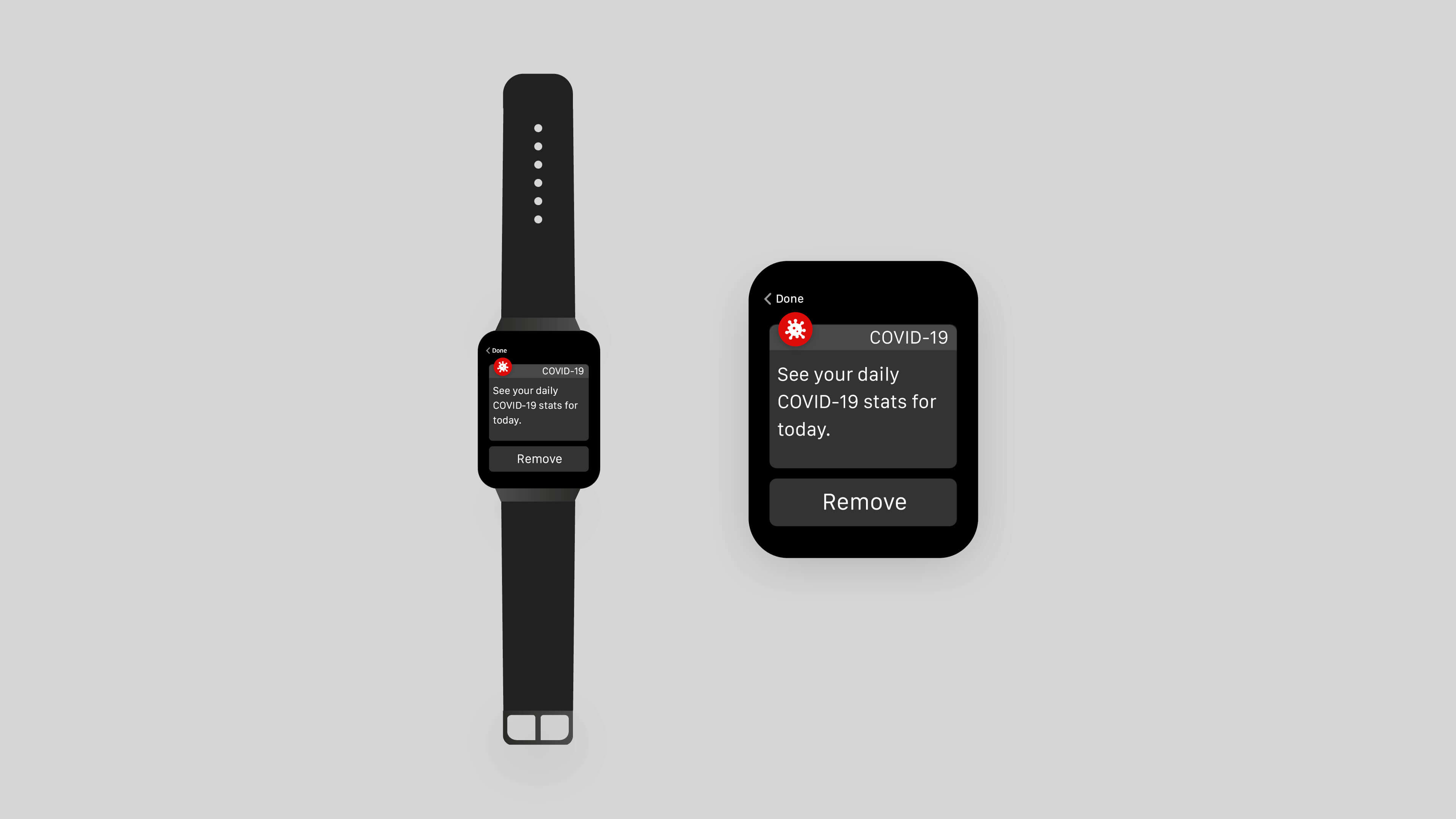
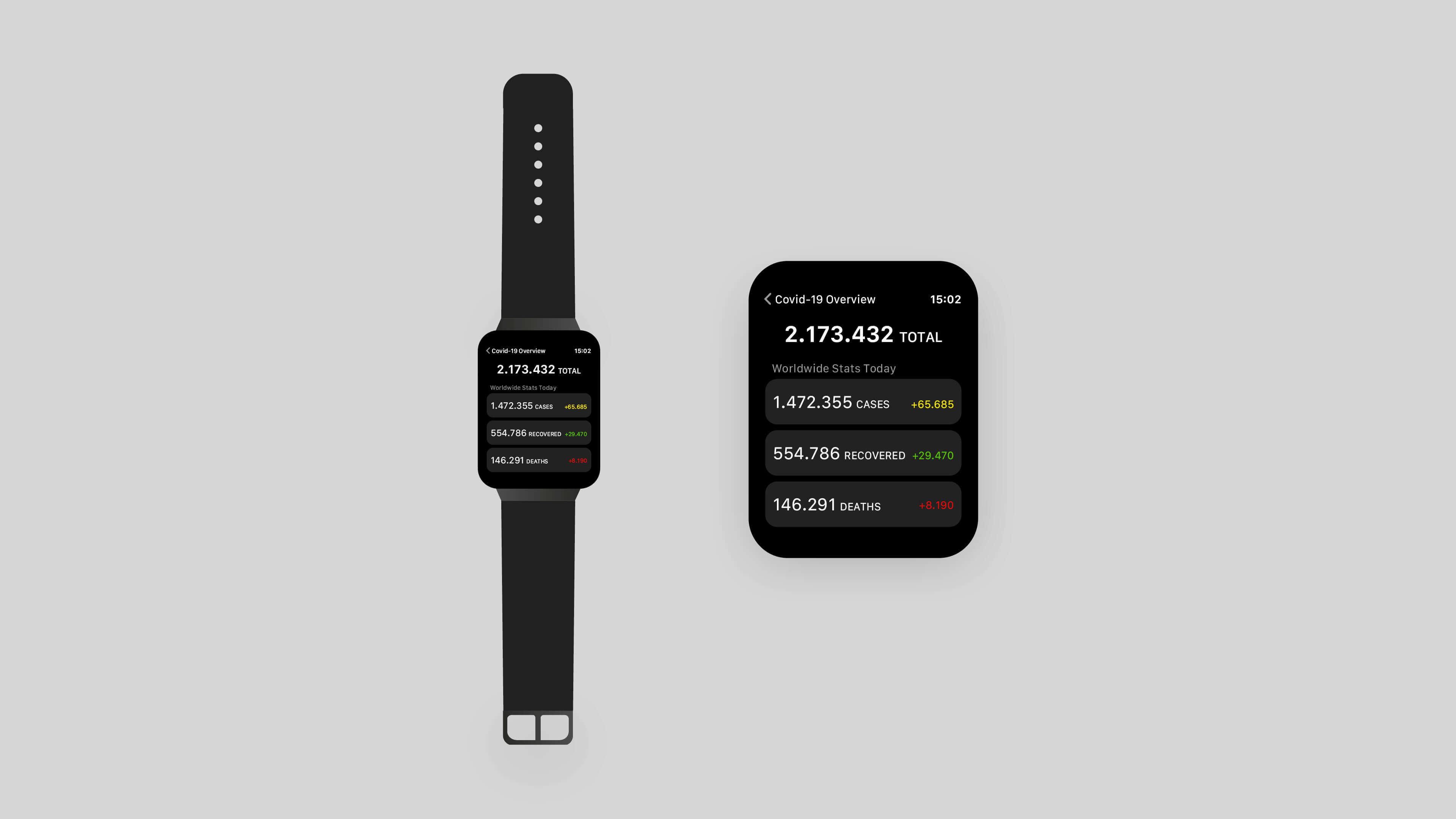
The design phase started with the smallest available device because the available screen real estate would be the biggest challenge. On a smartwatch, it is best to use the platform’s guidelines to make sure that the app behaves like the user expects. Therefore, I relied on the Human Interface Guidelines for Apple watches. The app is simple and only uses the minimum functionality. Firstly, the user can set a daily notification that displays the current data that refers to a defined region, e. g. the user’s region. S/he can use it as a part of his morning routine like checking on the news. The user can either remove the notification or tap on the notification body to get some more information.
On the web, there is more screen real estate available – especially on desktop. In this case, the user interface was added with some more features that add more interactivity. The user can either watch the COVID data on a worldwide level or can search for a specific country. The UI reacts on the selected data level so that countries are replaced by regional data. The data table can be sorted by the column (e. g. ascending or descending) which enables the user to manipulate the dashboard’s content to his/her needs. Plus, a map is added to the screen to display the huge number of values visually. This adds context to the data and makes it easier to understand. For instance, the users can easily see on a map, where a COVID-19 hotspot is.