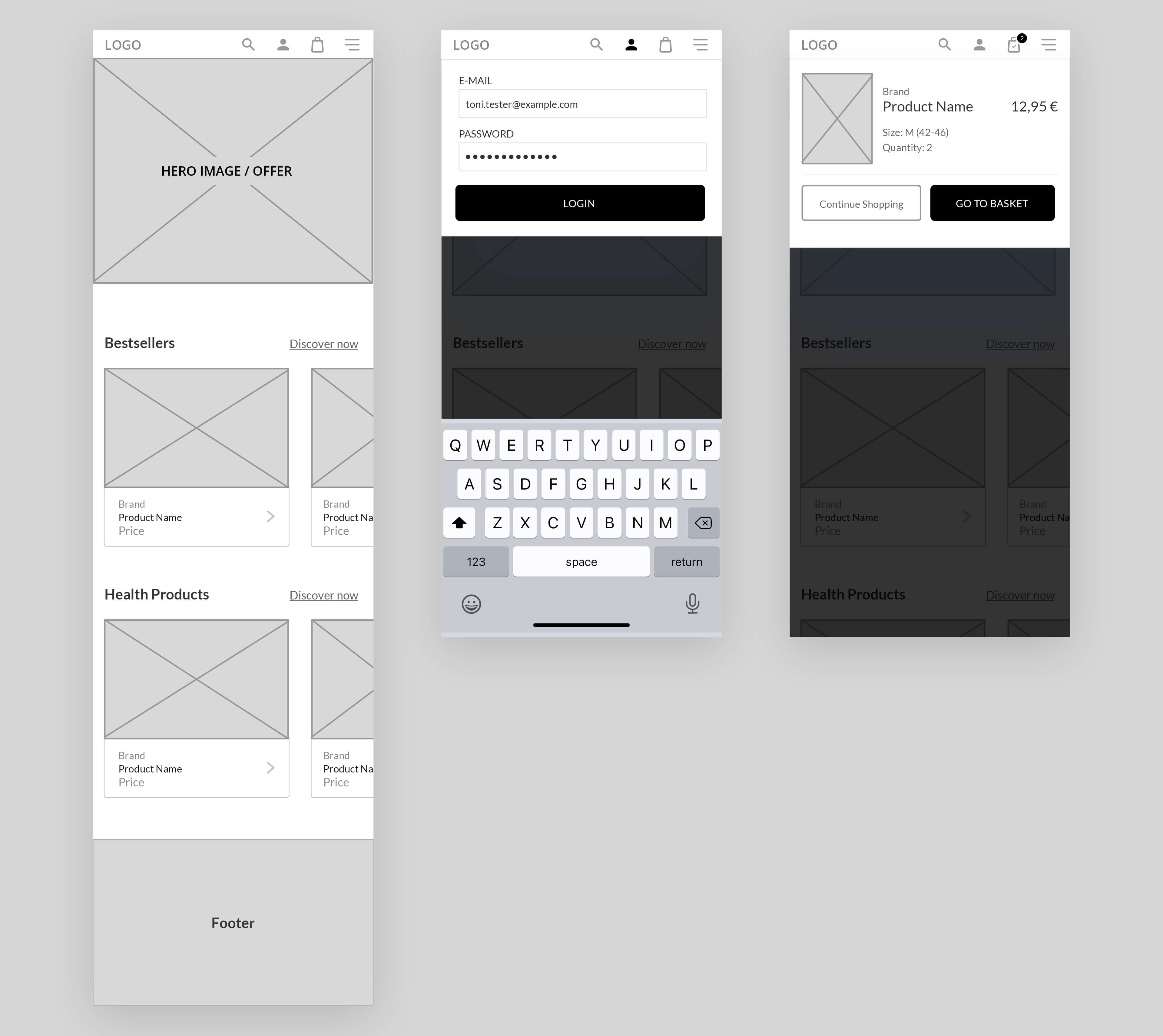
The goal was to develop an intuitive user flow for an e-commerce shop in the mobile view. The wireflow below focuses on the two main tasks “login” and “purchase a product”.
The user flow of purchasing a product on e-commerce website is crucial for the website’s success. Every funnel step needs to be as easy to succeed as possible so that customer will not have a reason to abort. That’s why the user flow needs to be planned and tested carefully. To illustrate the process for all team members, I created a flow chart that visualizes the overall process of login, writing a customer review and the product purchase.

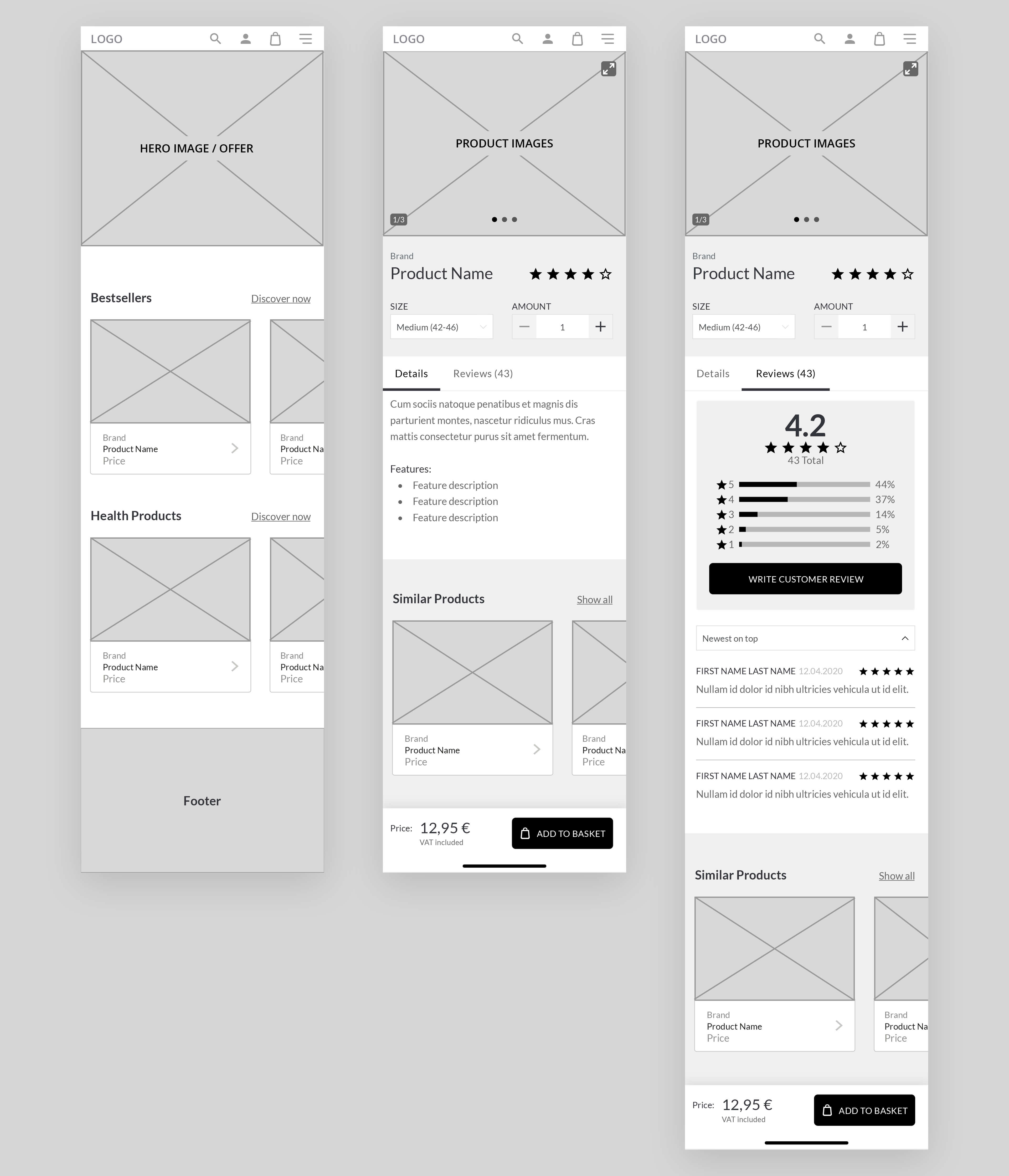
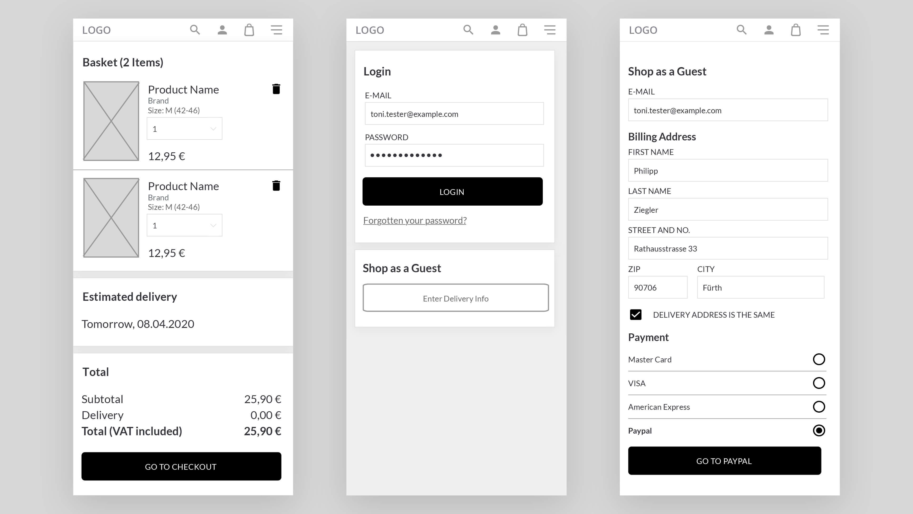
Based on the flow chart, I created wireframes for the main views. Errors and success states will be added later when the single branches are worked on. According to the wireframes, it becomes clear which content is planned to be included on the different views. Additional functionalities were added at this stage such as the filter on the product category page.
On the product detail page, the user should always have the possibility to add the product to the cards so there is a static section at the bottom of the screen which visualizes the price and the call-to-action.
Due to the lack of a mouse, the control elements for choosing the size and the product amount should be tough friendly. This is achieved by using a minimum height of 44px for button which is considered the suggested height for interactive UI elements.
The amount of products can be increased/decreased by either using the keyboard to input a specific value or the “+/-“-stepper. For choosing the size, a dropdown is used as the number of options will likely exceed five items and therefore would need a large of amount of screen real estate if it was displayed in a different way.
As a prequel of a prototype, I created a wireflow to illustrate which clicks will result in which wireframe. This is basically a combination of the flow chart and the wireframes.
